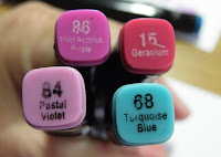
There's quite a buzz going on with some new markers on the market and I've been asked by quite a lot of people what I think. So this is my honest opinion and a few facts that I have managed to find out. Today I'll be reviewing the Spectrum Noirs and soon I'll be reviewing the new Letraset FlexMarkers.
Now some of you might be sceptical because I'm a pretty hardcore Promarker devotee, BUT I am not an employee of Letraset or any other company and therefore this is entirely my opinion, no-one has sponsored or paid me to do this review either.
I was given 3 of the tonal packs to try out, the Turquoises, Pinks and Purples - I chose these packs in particular because these are the colours I felt I could add to my promarker collection.
My initial impression wasn't good - I thought the printing of the colour names and numbers and also of the product name on the barrel and ends of the markers wasn't very good - parts were missing and appeared to be rubbed or scratched off. But that was just a minor point and is neither here nor there when it comes to performance, however it may make life difficult if it's hard to read the colour name/number.
Next I decided to make my own wee swatch cards so that I could see what each of the colours looked like on the cardstock that I normally use for alcohol marker work....
As you can see, some of the colour names/end cap colours bear no resemblance to the colour of the ink - I think the most noticeable is #88 Purple Grey!
I decided to try the Spectrum Noir pens out on different surfaces - I have used 2 weights of Diamond White cardstock from The Papeterie - I will edit with the weight details, I can't remember them off the top of my head - and the 3rd surface was Letraset's bleedproof paper which is 70gsm
here's the heavy (top) and light (middle) Diamond White and the Letraset Bleedproof (bottom)
I have also included a scan of the reverse side of each so you can see how "juicy" the pens are. Now this is only one layer of ink. In my opinion the Spectrum Noirs saturate the paper far quicker than the promarkers do and so you can't do as much blending or layering with the Spectrum Noirs before the paper/card is saturated completely with ink and then starts to bleed outwards across the paper/card.
Next I tried some colouring.....
From the waist down I have coloured like I would with promarkers e.g. from dark to light, I used Geranium (15) in the darkest areas, then coloured over it and outwards with Rose Pink (8) - now these two blended reasonably seamlessly and I was quite happy with it, but when I coloured over the whole skirt and then tried to blend the Medium Pink (137) onto the skirt it started to look a bit strange - it looked like the 137 was bleaching out the colour of the other 2 shades in the same way a blender pen would. However, when it dries, it doesn't look so bad and the blending looks quite good.
I went from light to dark from the waist up, first colouring the whole area with 137, then dotting on some 8 followed by 15 in the darkest areas - working quickly so that the ink was still wet, but this doesn't make for a smooth transition between shades.
In conclusion, working from dark to light, I did get the end result that I was after, but it was quite disconcerting when I tried to blend in the palest shade - I think the end result is more to do with chance than anything else.
And lastly I thought I would try to illustrate where these packs of Spectrum Noirs would fit in with your promarkers - I've done this because I know a number of you have bought some Spectrum Noirs to add in to your promarker collection. It's obviously not an exact science as they are not designed to work with each other, but this is the best I could come up with....
CONCLUSION: this is purely my opinion, I don't like them - I did want to like them and to be honest I was very disappointed. I was hoping I would be able to fit them into my promarker collection, but I'd rather pay that bit extra for the new Flexmarkers and Trias to fill the gaps in the colour chart of the promarkers :)


.jpg)


